MARVEL'S AGENT CARTER S1E5 “The Iron Ceiling” (review) AT FORCES OF GEEK
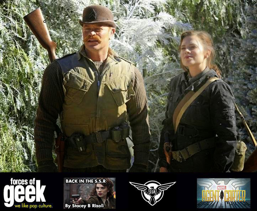
From the cold open to a young Dottie in ‘Russia, 1937’ to an appearance from Dum-Dum Dugan (Neal McDonough) and his The Howling Commandos, Marvel’s latest Agent Carter is something Jack Kirby himself would be proud of.
Ramping up the action, our strong leading lady Peggy Carter (Hayley Atwell) is entrusted with her first mission — but will our cover girl have her cover blown by the arrogant (and over-the-top sexist) Agent Jack Thompson (Chad Michael Murray) or Agent Souza (Enver Gjokaj)?
In Russia — spoiler warning — they have a Black Widow training program, and the origin of Dottie’s (Bridget Regan) exploits in the last episode. Does it surprise anyone that the Russians used a clip of Walt Disney’s Snow White promising to ‘keep house for you’ to teach the kids English in this all-girl Russian Fight Club? Here we see a younger version of the immersion seen in Showtime’s The Americans flashback sequence!
[READ MORE AT FORCES OF GEEK]
A Stacey/Clay review! XO
New Client - Trifecta Editions
Happy to be working for Trifecta Editions and my good friend David Buckley Borden.
Here is a crosspost from the Trifecta Tumblr.
Interview with David Buckley Borden, Artist and Landscape Designer
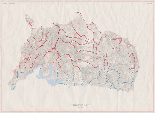
Watershed Down Map, Digital Media, Fall 2013
David Buckley Borden is a graduate of the landscape architecture masters program at Harvard University’s Graduate School of Design. Until recently, he worked as a designer within the Urban Studio at Sasaki Associates and now works at Ground Inc, a boutique landscape architecture firm known for its artful landscapes. David is a landscape designer and artist, and recently worked with us to create a print and postcard pack.
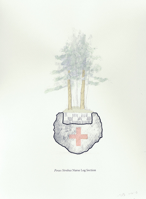
Nurse Log Section, Mixed Media Series: Ink, graphite, colored pencil and carbon transfer on paper, 8.5 x 11”, Winter 2013.
How does your landscape architecture practice influence your art?
Most of the ideas behind my art stem from my landscape architecture practice. This includes the underlying ideas and concepts but also the drawing techniques. If landscape architecture is my work, art is my play and I often play by experimenting with landscape drawing conventions: the scaled map, contour lines, cross section, offsets, line weights, annotation, etc. More importantly, the artwork is a creative exploration of landscape architecture related interests: landscape history, ecology, geology, land use and just about anything related to “the great outdoors.”
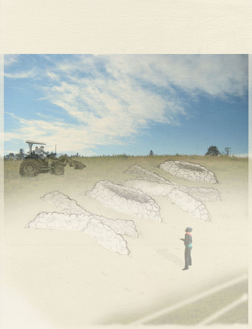
Granite Love Letter, Landscape Installation Proposal, 8 x 10”, Winter 2012.
Tell me about your recent artwork.
Some say I’m obsessed with New England…and its true! I love exploring North American landscapes, especially New England and Eastern Canada. Sure, I enjoy a road trip and hiking through the woods, but most of my explorations are on paper—in drawings I make in my Cambridge studio. And, many of these creative explorations start with books. I rely on an ever growing list of authors who write on the topic of landscape from a variety of perspectives: Howard Mansfield, John Stilgoe, Richard Forman, Peter Del Tredici, J.B. Jackson, and of course Eric Sloane. It’s actually shameful that I don’t spend more time outdoors, but I am working on that…
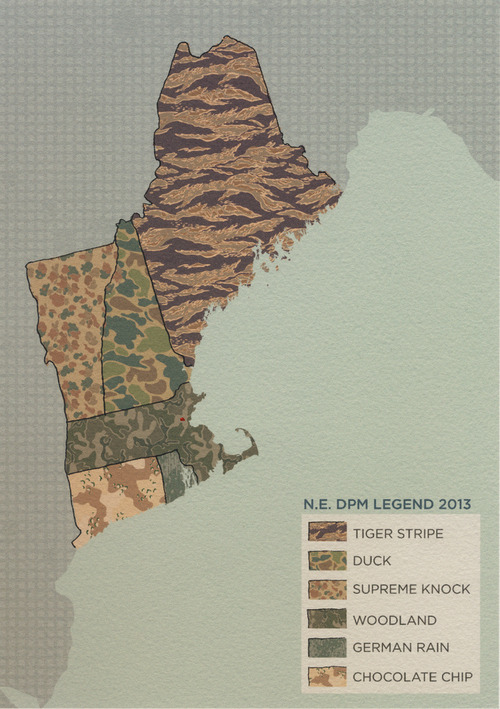
New England Camouflage Preference Map, Mixed Media, 9 x 12”, Winter 2013.
And your maps?
While in graduate school I was drilled with “rigorous map making.” The rigor almost killed maps for me but common sense and creativity prevailed. I now enjoy exploring and expressing ideas through making maps. In particular, what I call “NTS” (not-to-scale) mapping. These maps are for exploring places…but not in the spatial sense—more along the lines of cultural landscaping, the meaning of place, and regional identity, specifically the identity of New England. When asked where I’m from, I sometimes respond that I’m from the state of New England. New England is my home range and my favorite map-making muse.
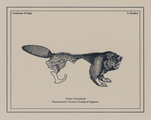
Massachusetts’ Premier Ecological Engineer, Silkscreen Print, 8X10”, Fall 2013.
Tell me about Fort Buckley.
Fort Buckley, also known as Fort Chauncy, is what I jokingly call my live/work space. My wife and I live in an apartment on Chauncy Street in Cambridge where I have a small studio space. I also use the apartment as a place to display and sell my artwork. So, Fort Buckley is one part studio space, one part DIY gallery, one part creative cocoon, but all parts home. ‘Fort Buckley’ has also developed into my creative battle cry. I dig all sorts of creative ditches for other folks, but the Fort is really the space where I pursue my own creative interests…it’s a fort of creative self-indulgence.
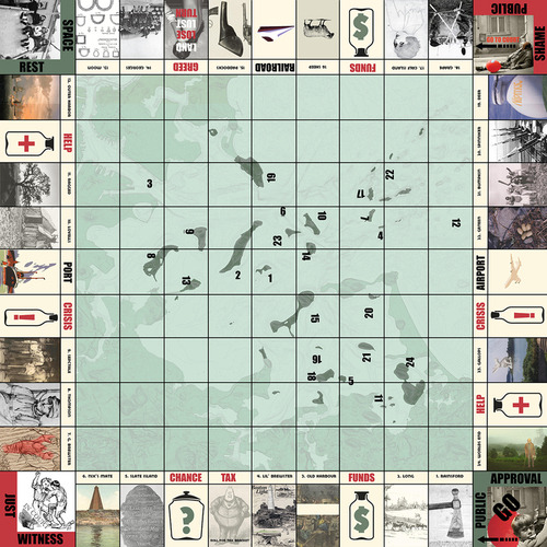
Battel for Boston Harbor, Digital Collage, 18“ X 18,” Fall 2010
As someone with both business and design experience, you have a unique background …what’s your take on the business of art?
I’m a big believer in the economics of sustainability. Sustaining art, like anything, requires resources. There’s time and money out there, you just need to develop the networks and the infrastructure to find and capture it. I am a believer in the practice of being a “working artist.” It’s not easy, but I love the whole experience of art: creating it, discussing it, sharing it and even selling it. Art and craftsmanship have some unique economics as well. For example, I am a big fan of giving art as gifts. When you purchase art as a gift for someone, you are really giving two gifts with your purchase. First, you are gifting the piece of art to the recipient, but you are also giving the gift of financial support to the artist.
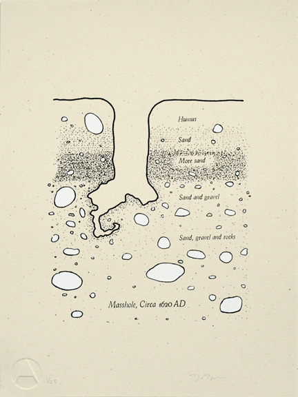
Masshole Classic, Silkscreen print, 9 x 12”, Fall 2013.
Tell me about your new prints available from Trifecta Editions.
The print, titled “Masshole Classic” stems from a long running drawing series in which I play with the derogative expression of “Masshole” and a variety of Massachusetts’ soil horizons, both real and fictitious. This print features a generalized Cape Cod soil profile that includes almost nothing but sand and rock. The original sketch can be found in my notebook for a soils class with Peter Del Tredici, but over the past couple of years it’s developed into a series of drawings. Now, thanks to Trifecta Editions, it’s a limited-edition print.
The Lottery Ticket Comic

The Lottery Ticket Comic The lottery ticket that is guaranteed not to disappoint! The instantaneous, over-night fulfillment of lifelong dreams, the adoration of your friends and family, the ability to do what you love without worrying about the costs — this is every man’s dream.
And we’re not talking about suddenly becoming a movie star, either. Instant rewards are something that all humans are wired to desire, which explains why, according to the PBS, from as far back as 1996, over 60% of Americans have been involved in some form of gambling or another. Most people gamble for financial gain, or the adrenaline rush of seeing those dice roll over and make your day. While some winners have developed winning techniques, like Richard Lustig, who’s published a book detailing his techniques, which ranked #3 in Amazon’s Self-Help category in 2010, some winners, like William Post have experienced nothing but disaster following what they thought would be the greatest day of their lives. Gambling and the lottery continue to attract thousands of people everyday, with some flocking to casinos in Las Vegas for a round of cards, and some choosing to play a game of Uptown Pokies from the comfort of their computers. While lottery tickets have become a symbol of both hope and despair for people all over the world, one comic book artist has turned it into a whole new form of art.
Peter S. Conrad has been experimenting with different mediums for years, transforming his comics into things never heard of before, like cassette tapes, cigarette packs and Rubik’s Cubes. In the 2011 San Francisco ZineFest, he revealed his latest creation: a comic in the form of a lottery ticket. This ingenious design brings comics to a whole new level. It eliminates a common problem that impatient comic book readers seem to have: skipping right to the end panel and spoiling the ending, while still allowing readers to go through each panel at their own pace. The anticipation of what could happen next, and the joy that comes from scratching off the ticket just add to the whole experience. Conrad’s unique comics have been featured in various newspapers and exhibited in museums all across the United States, and rightly so. After all, it takes an exceptionally talented man to turn something like a lottery ticket into an instrument of entertainment and fun.


